The Challenge
The COVID-19 pandemic brought about an increase in online shopping because of government-imposed restrictions and consumer anxiety over the potential health risk associated with in-store shopping. For this project, I wanted to explore the current state of the online shopping experience.
Problem and Solution
Online shoppers need a way to make easy, secure and efficient transactions without the need for a physical credit or debit card because it's a hassle using multiple credit or debit cards when shopping online or in-store.
Role
UX/UI Designer
Duration
Nov 2020 - June 2021
Tools
Adobe XD, Photoshop, Balsamiq, Miro, Google Docs
Olivia, The Online Shopper
Olivia is a mother wary about shopping in a physical store during COVID-19. She needs to feel secure making online purchases.
Wants a quick checkout process
Needs to track her spending
She wants to send money to family in India
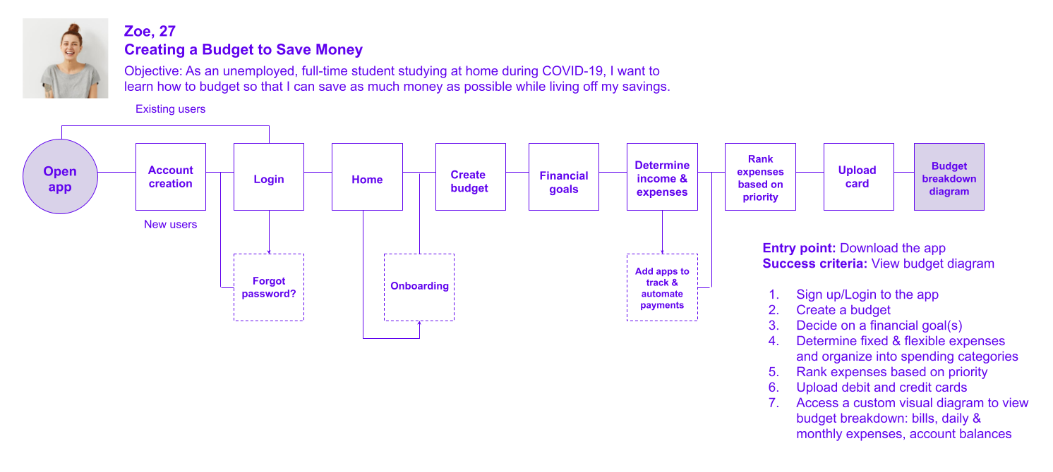
Zoe, The Full-Time Student
Zoe is unemployed and needs to save as much money as possible while studying at home during COVID-19 as she is living off of her savings.
Needs help with money management and budgeting
To get a lay of the land in the mobile payment app space, I did some market research on popular mobile payment applications such as Apple Pay and PayPal.
Identifying my competitors’ strengths and weaknesses by studying their app features helped me generate ideas and find loopholes. For example, Apple Wallet has useful features applicable to everyday life such as a car key feature, student ID, rewards and loyalty cards, boarding passes, events and transit, but is only exclusive to Apple devices. This was an opportunity to provide an e-wallet app compatible with iOS and Android operating systems with similar features and something they don’t include in their app: a budgeting feature.
I wanted to know what would motivate users to use an e-wallet web app and what current e-wallet users think about other e-wallet products on the market.
Also, I wanted to know if they would find a budgeting tool helpful. With these questions in mind, I created a 20-question survey and launched it on the CF Community Slack channel and my LinkedIn page.
By humanizing my data into realistic users, I learned that I needed to prioritize the need of saving money, creating an efficient and secure shopping experience, and sending money. That’s where user flows became effective. This process was like drawing out a blueprint of how my users could achieve these goals.
Flow Diagrams
Wireframing took on as a brainstorming session helping me visualize my idea for a payment app with a budgeting tool.
My idea behind the budgeting feature was to have artificial intelligence perform a financial audit on the user's debit card so that it can analyze their spending habits and help them best create a budget for their financial situation.


Some changes made from low-fidelity to mid-fidelity are:
1. Asking the user’s financial situation at the beginning of creating a budget to ensure inclusion of those who are between jobs. Both of my personas happened to be unemployed.
I thought this would be beneficial so that artificial intelligence can customize a budgeting plan for users who are dealing with a loss of income. So that’s why I added these three screens into the mid-fidelity “create a financial goal” flow as you can view below.
2. Inserting text fields instead of scanning card
Instead of the user scanning their card in preparation for the financial audit, in order to successfully connect to their bank, it made more sense to insert text fields. A user needs to provide their routing and account numbers to accurately identify their financial institution and accounts.
High-Fidelity Wireframes
Some changes made from mid-fidelity to high-fidelity are:
1. Prioritize creating a budget from the other financial goals presented.
Initially, a user would choose a financial goal like saving up for a car, paying off debt or creating a budget. Then I started thinking if it made sense to categorize ‘creating a budget’ under a financial goal. For the sake of clarity, I require users to create a budget as their first step.
2. Update navigation bar
In the mid-fidelity prototype, there was only two screens: Wallet and Analytics. The send/request money button was displayed on the Wallet screen. Here, I decided to create a three-icon navigation bar which is standard for most apps. I changed the design adding icons under Wallet and Budget to allow users to easily find the information they need. As for the send/request money button in the middle, I didn’t add text underneath. Writing out send/request money was very long and I assumed users would recognize this icon to the corresponding task.
Usability Testing
The resulting prototype was an initial hypothesis on how I hoped to solve the problem. By conducting usability tests, I wanted to observe and measure if users understood the app, it’s value, and how well they could complete the basic tasks such as signing up, sending money, adding a debit card and creating a budget.
The study tested 6 participants who were recruited through the CareerFoundry Slack channel.
A moderated remote test was performed via zoom and recorded for each participant.
Test Objectives
Determine if participants understand what the app is about quickly and easily (i.e. an ewallet app for shopping, sending/requesting money and budgeting) and the value it provides
Determine if participants find the ‘creating a budget’ task is a logical and helpful process for reaching their financial goals
Find out if participants can easily locate the ‘send/request money’ button
Does the homepage and budget page meet their expectations?
User Testing Results
Most of the participants liked the Digipay app and found it easy to navigate through. They liked the clean and simple interface. Sending money and uploading card tasks were easy and smooth for participants to perform, but found ‘creating a budget’ to be the most complex and confusing.
Usability Issues and Making Changes
*Errors were measured using Jakob Nielsen’s scale
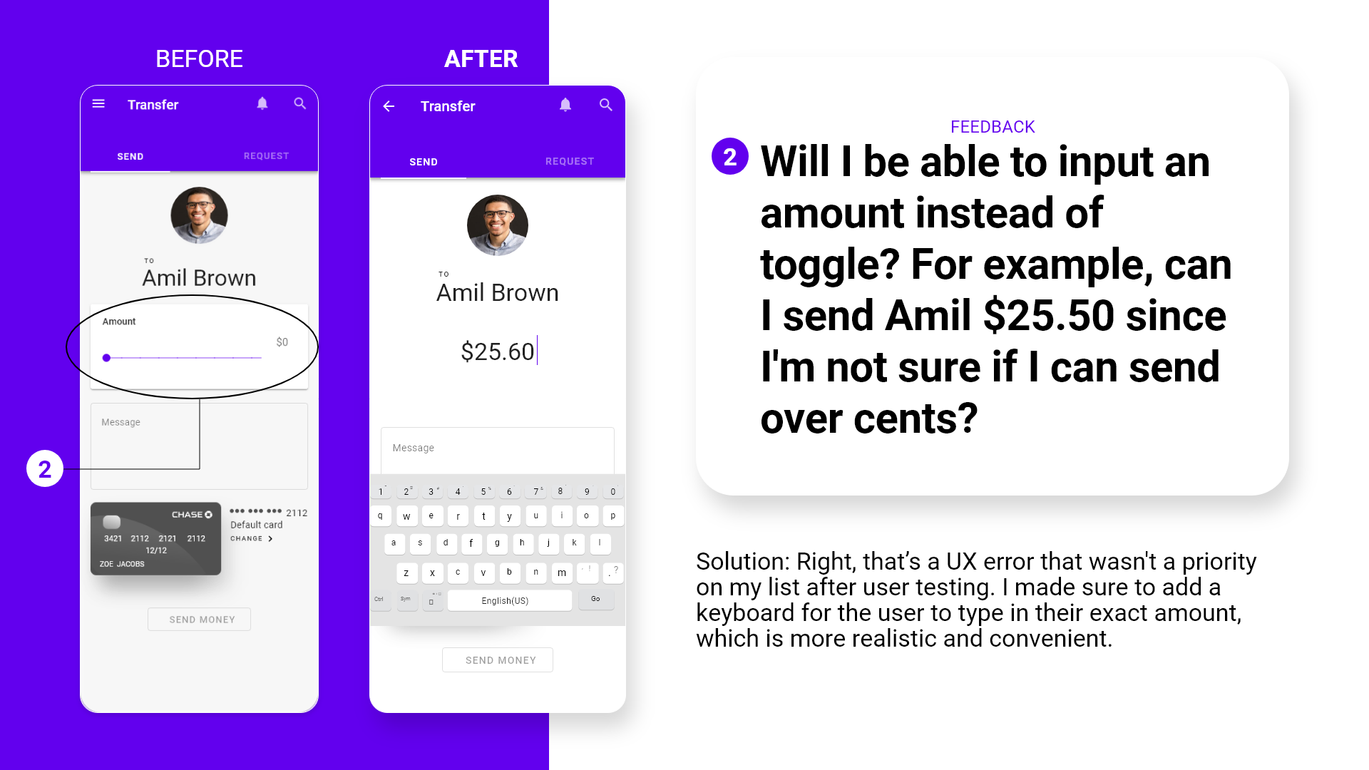
Issue 1: Amounts changing automatically in the ‘Prioritize and Calculate’ screen. [Error Rating 4]
Suggested Change: Add up and down arrows or a slider for users to set limits on spending amounts manually.
Evidence: Approximately 80% of participants questioned if they were the ones who changed the spending amount in the ‘Fast Food’ spending category after viewing the notification informing them of this change.
Issue 2: Introduction screen doesn’t look like the typical introduction screen. [Error Rating 3]
Suggested Change: Breakup onboarding into three visual screens highlighting features with a three-dot carousel. Present onboarding first, then show login/signup screen.
Evidence: P3 said, “I think a nice introduction screen would be a lot more friendlier as opposed to 'here's what we do!’” P5 said, “Normally, this is not how onboarding screens present info. Mostly, everyone uses a carousel slider so this is something new.” P1 asked, “Is this some kind of onboarding screen?”
Issue 3: Send/request money button is not clear to its corresponding task. [Error Rating 2]
Suggested Change: Include a description under button or change icon
Evidence: 50% of participants (P1, P4, and P6) didn’t think a dollar sign represented the send/request money task well because it wasn’t obvious to them.
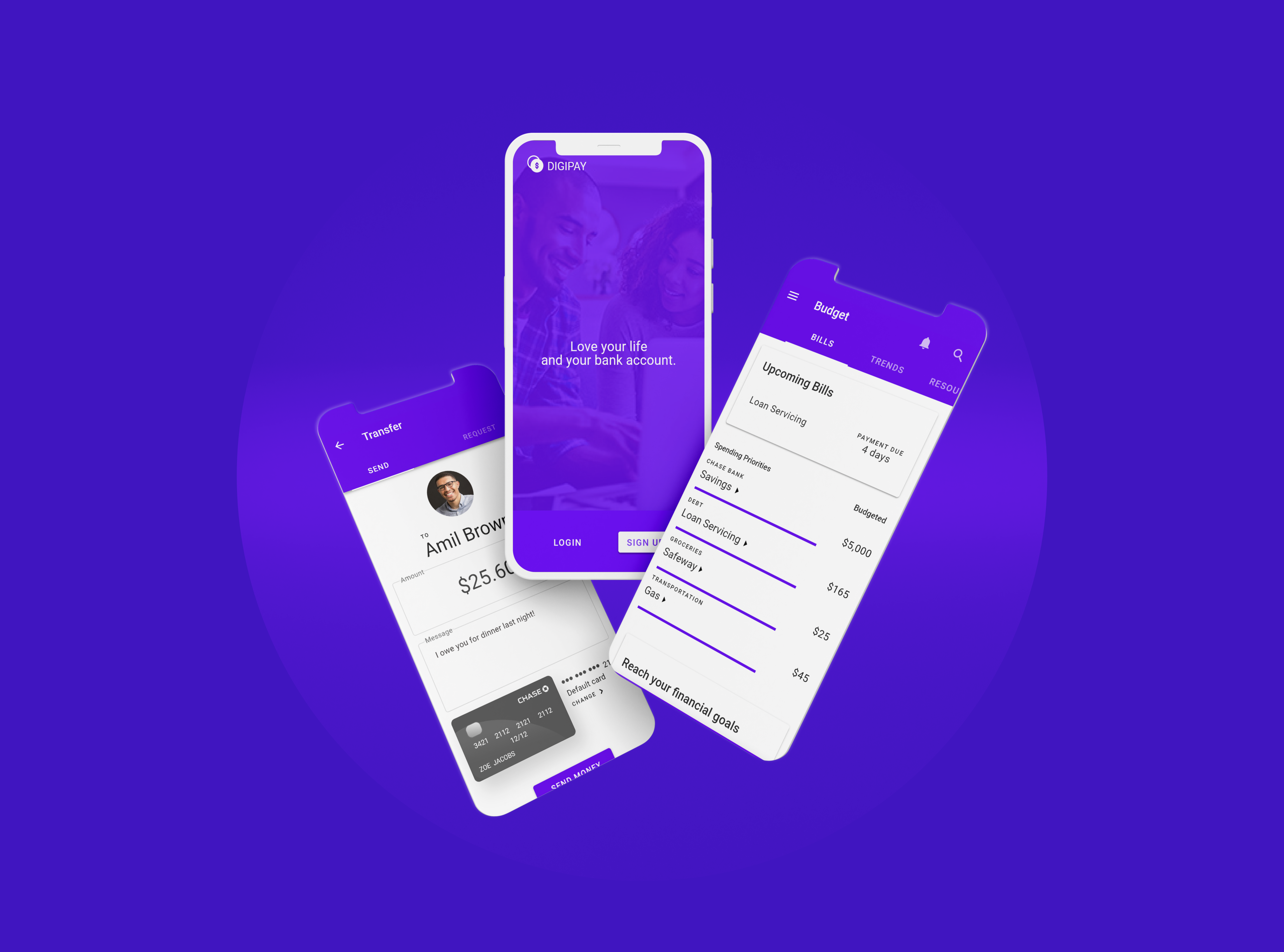
Final Visual Design
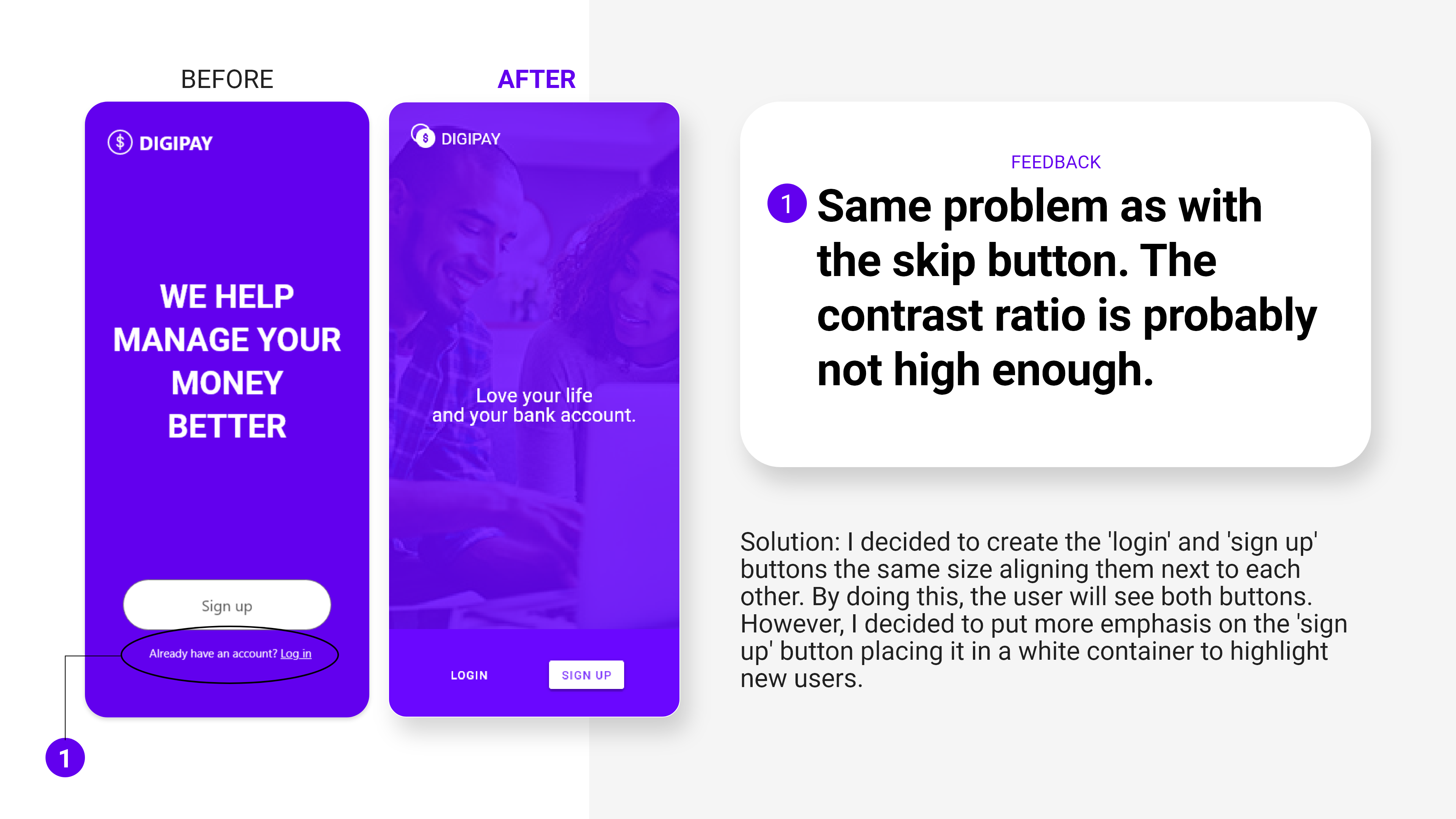
To redefine my high-fidelity prototype a bit further, I welcomed my peers to provide me with feedback. I wanted to get a second round of opinions to catch mistakes or make any refinements to Digipay. As a result, there were quite a few usability issues that needed to be ironed out in onboarding, sending money and creating a budget.

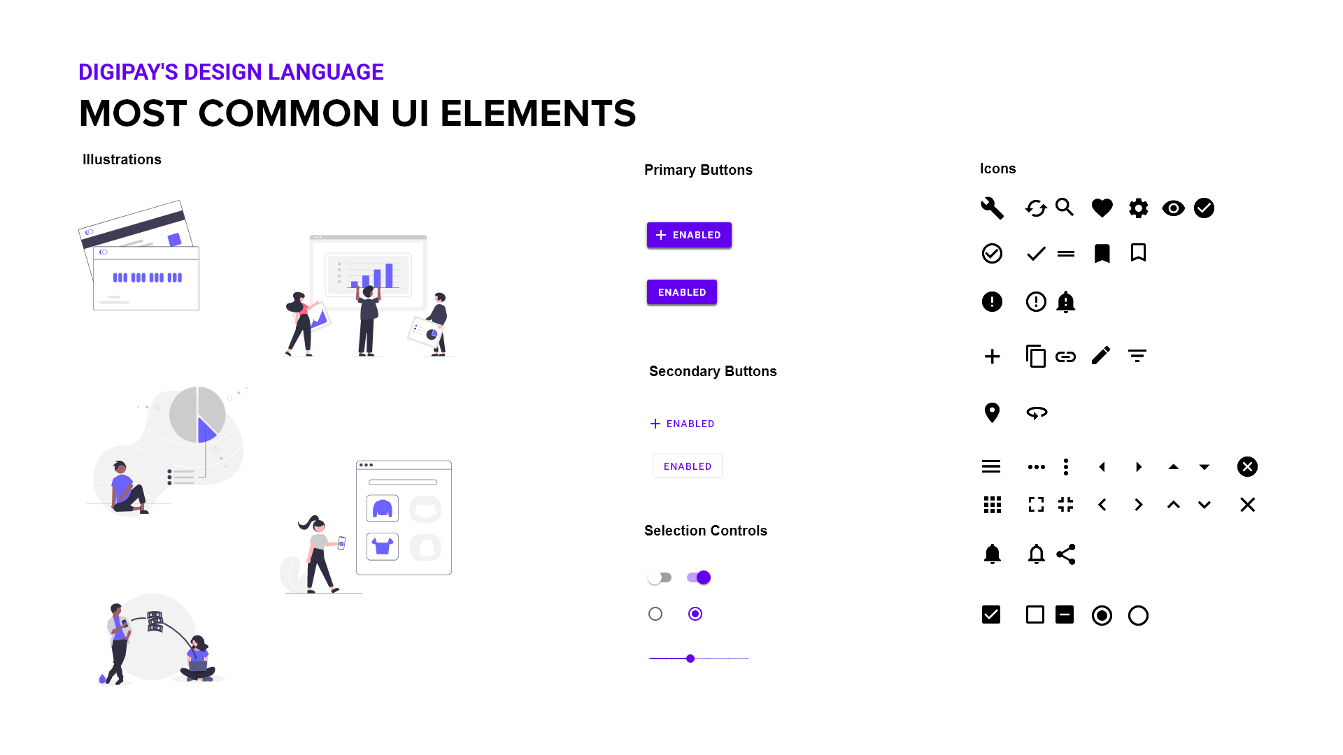
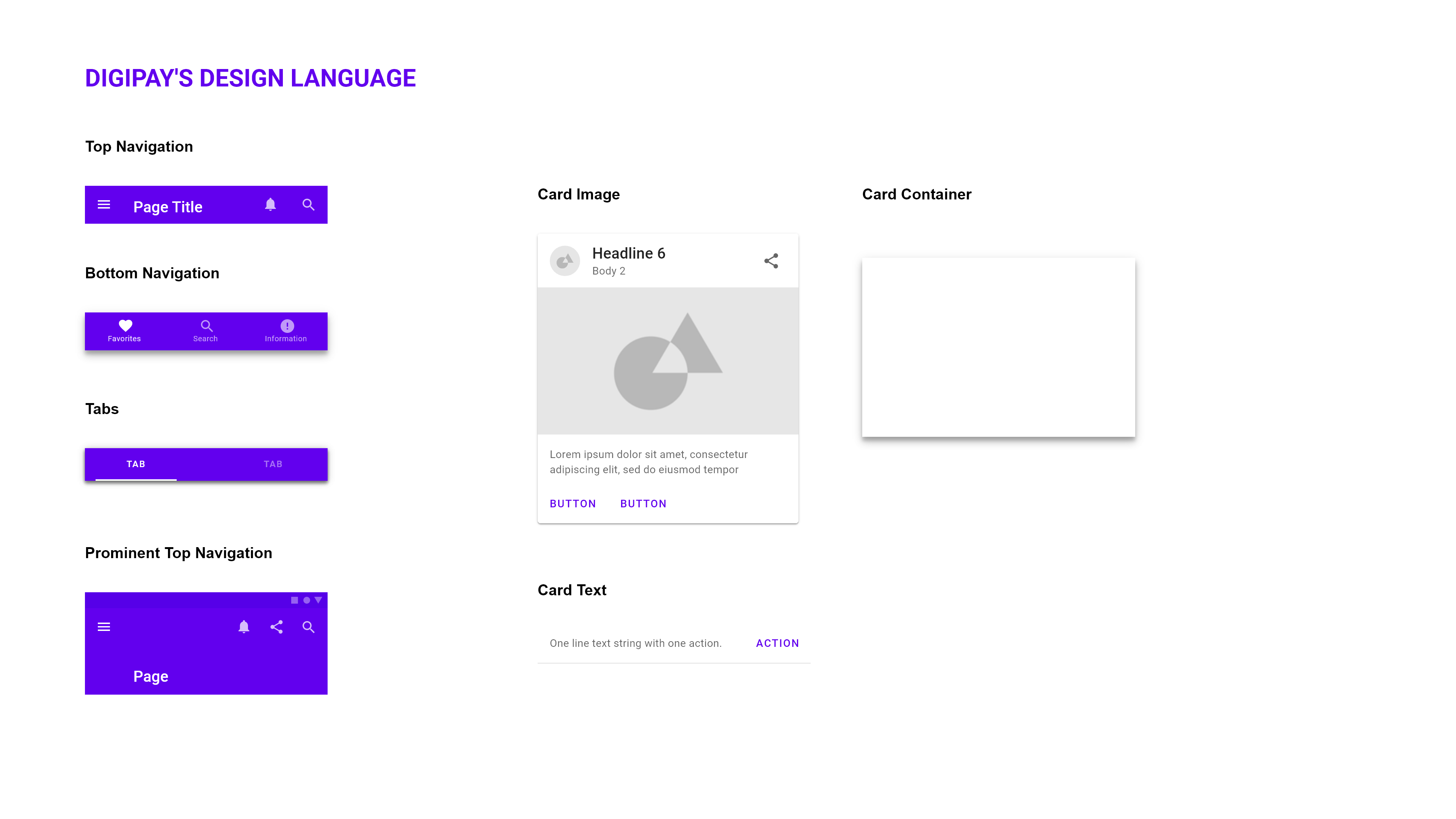
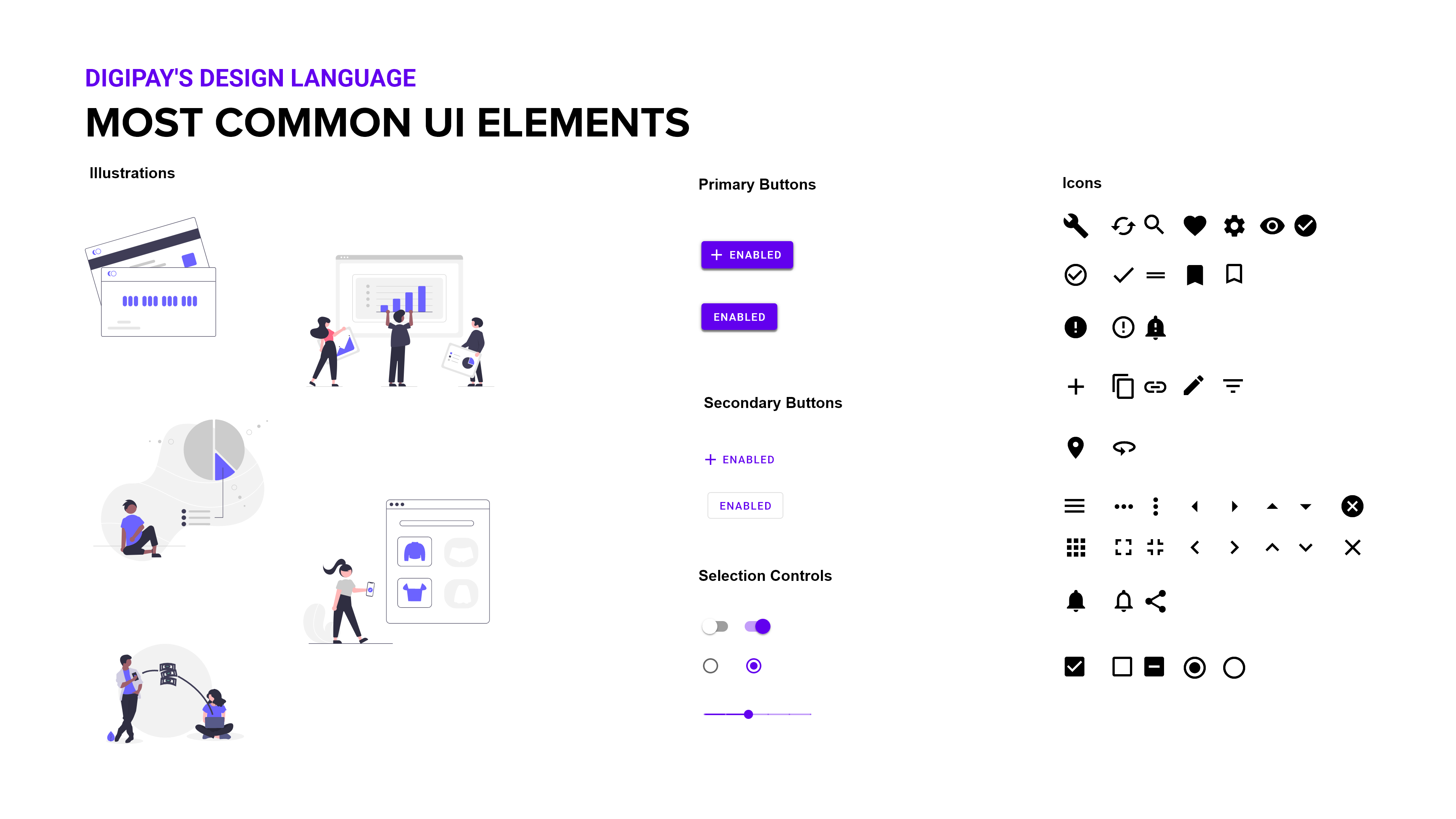
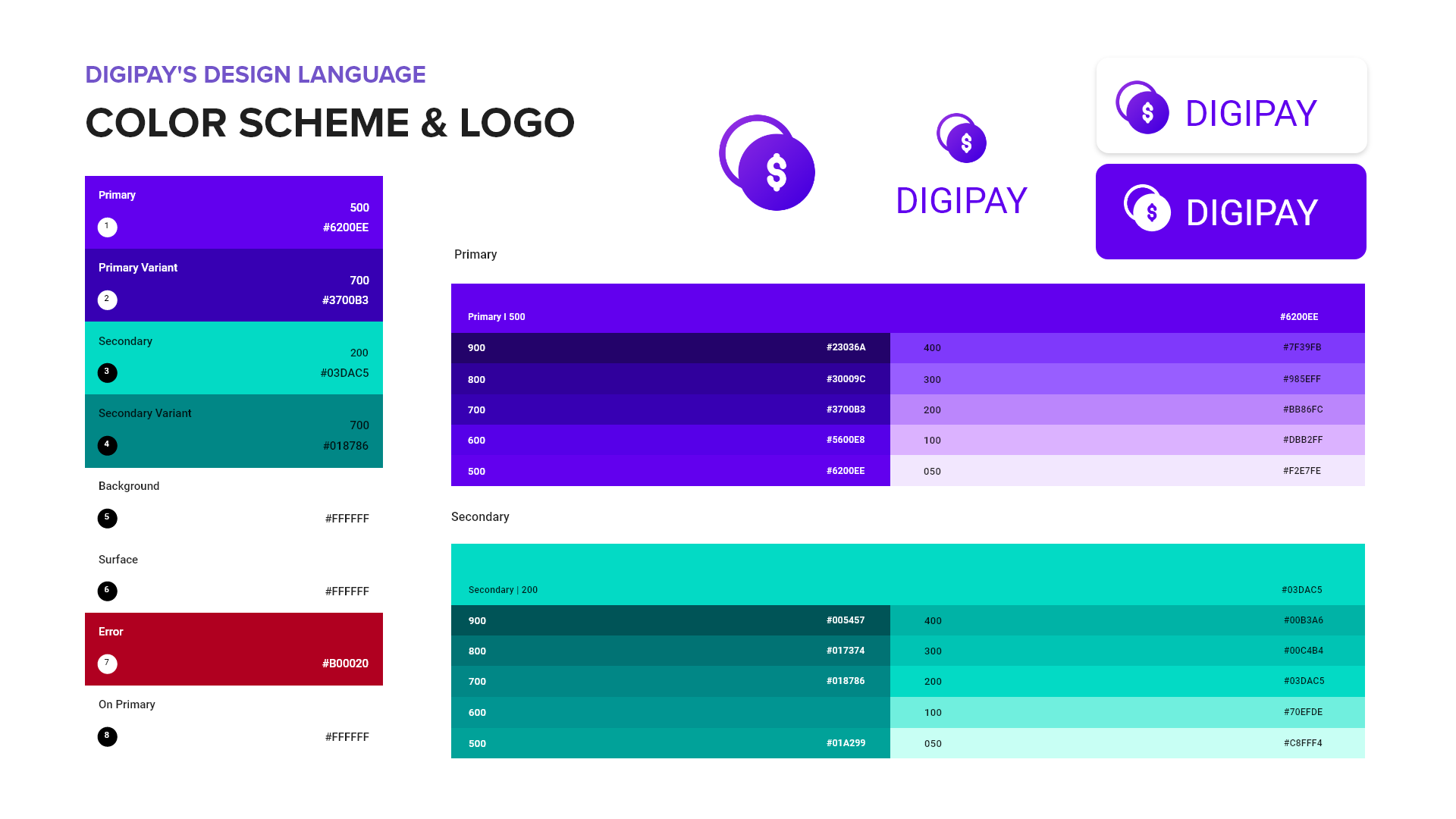
Design System


Final Design
Check out the Digipay app!

What I Learned & How I Became A Better Designer
Mastering the art of good interviewing should not be an interrogation, but rather a productive conversation.
That way, it can be more natural for the user to share a piece of their experiences and perspectives which allows for a better flow of insights. I wish I initiated more conversational sessions during user interviews and expanded my range of follow-up questions to get a holistic view of the user. Next time, I should approach interviewing in a more lenient fashion, not being afraid to veer off prepared questions.
More complete wireframes for usability testing, the better.
I wish I presented a detailed, high-fidelity prototype for user testing. The one I showed to users was in greyscale and didn’t incorporate much visual detail such as logo, icons and illustrations. If I had made it more realistic, user testing results could have changed significantly and the first impression of the app wouldn’t be as vague. This was due to not having a vision with branding.
Adding more tools in my toolbox.
I’ve learned how to use different software applications and online platforms. I’m now more comfortable using Adobe XD, Adobe Photoshop, Balsamiq, InVision and Miro.
It takes a village.
As a designer, I don’t always have the right answers. That’s why I need other people’s opinions and feedback for better evaluation of my designs (because at the end of the day, it’s not about me—it’s about the user). Many times, I’ve had to step back from my designs and have another pair of eyes look at it. I wouldn’t have completed this project without the help of my fellow CF classmates via the Slack community.
A good system shortens the road to the goal.
A project as complex as this one caused me to get overwhelmed, especially at the final design stages of the Digipay app. There were a lot of moving parts and small pieces, which added to the intensity of the design process. I believe what would have helped me is knowing how to organize my workspace better. Because I recognized the importance of organizing my work so it can save me time in the future, I want to put more emphasis on maintaining a clean workspace for future projects.