The challenge
Edina, a certified professional life coach, is starting her own life coaching business. She partners with her clients to increase awareness, reduce stress, and remove obstacles that are holding them back from living purposeful lives. To officially start this amazing work and keep growing her client base, she needs a website. And our team was entrusted to create a site for users to learn more about Edina and her life coaching services.
Problem and Solution
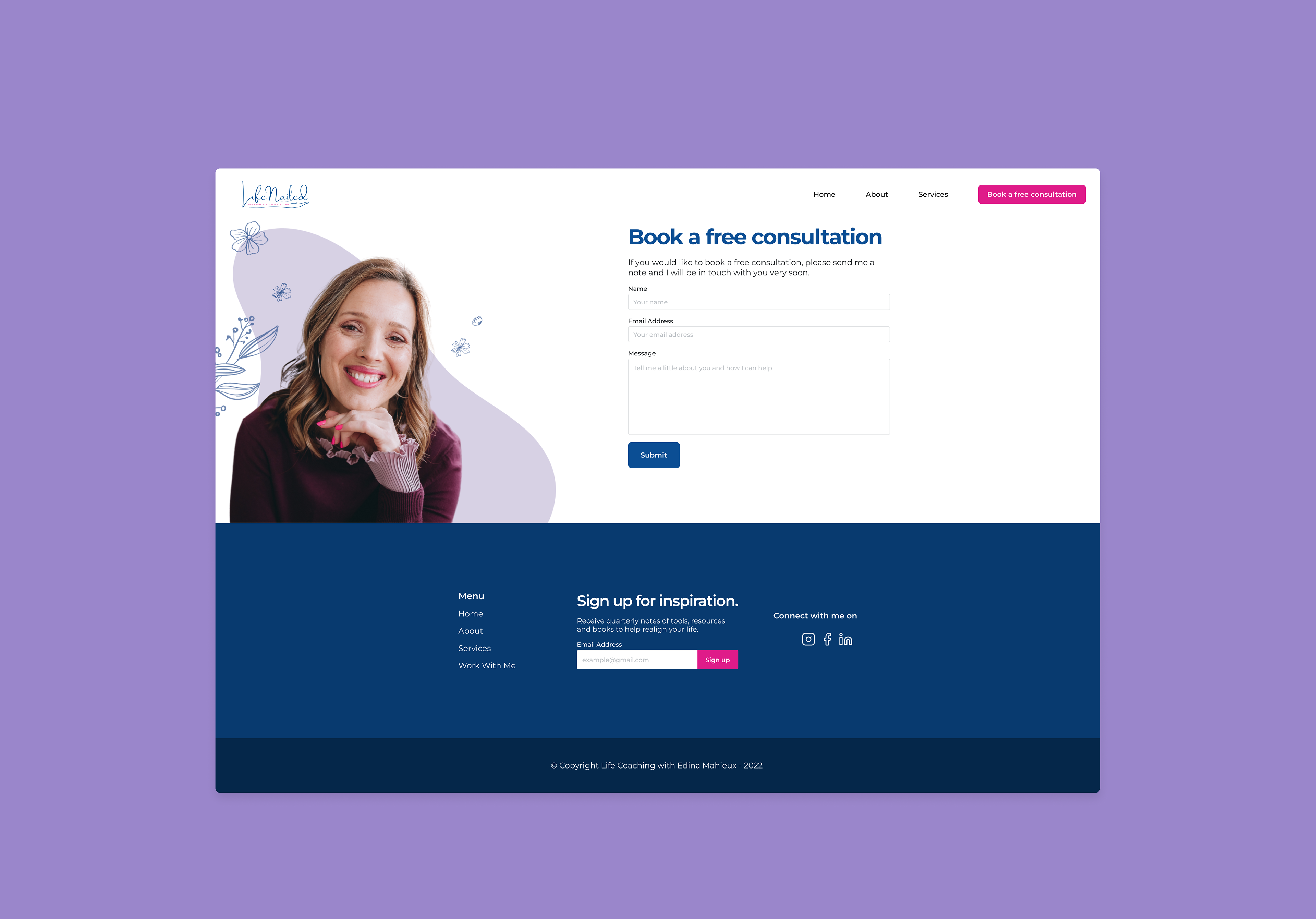
Edina needs a way for potential clients to contact her so she can have a conversation with them and see if they would be a good fit to work with. So our team designed a contact form on the website so that potential clients can book a free consultation with her.
My Role
UX/UI Designer
Duration
May 2022 - Aug 2022
Tools
Slack, Miro, Google Docs, Zoom, Figma

Christina, The Curious Career Changer
Christina is unhappy with her job in corporate sales and needs support in discovering her passion and deciding on a career change.
Feels stuck and empty in her career
Lacks confidence to enter a new field
Needs accountability, support & guidance

David, The Depressed Divorcee
David recently divorced his wife and needs support navigating his separation and extra free time.
Feels lost, unmotivated and heartbroken
Seeing a therapist
Wants to rebuild his life
Needs help moving on & focusing on his personal goals
My process started with a team huddle
The UX/UI team met to share each of our rough sketches for the Home, About, Services, and Work with me pages, and we saw an opportunity to explain Edina's work since survey findings from the research team revealed that the majority of people have not worked with a life coach before.
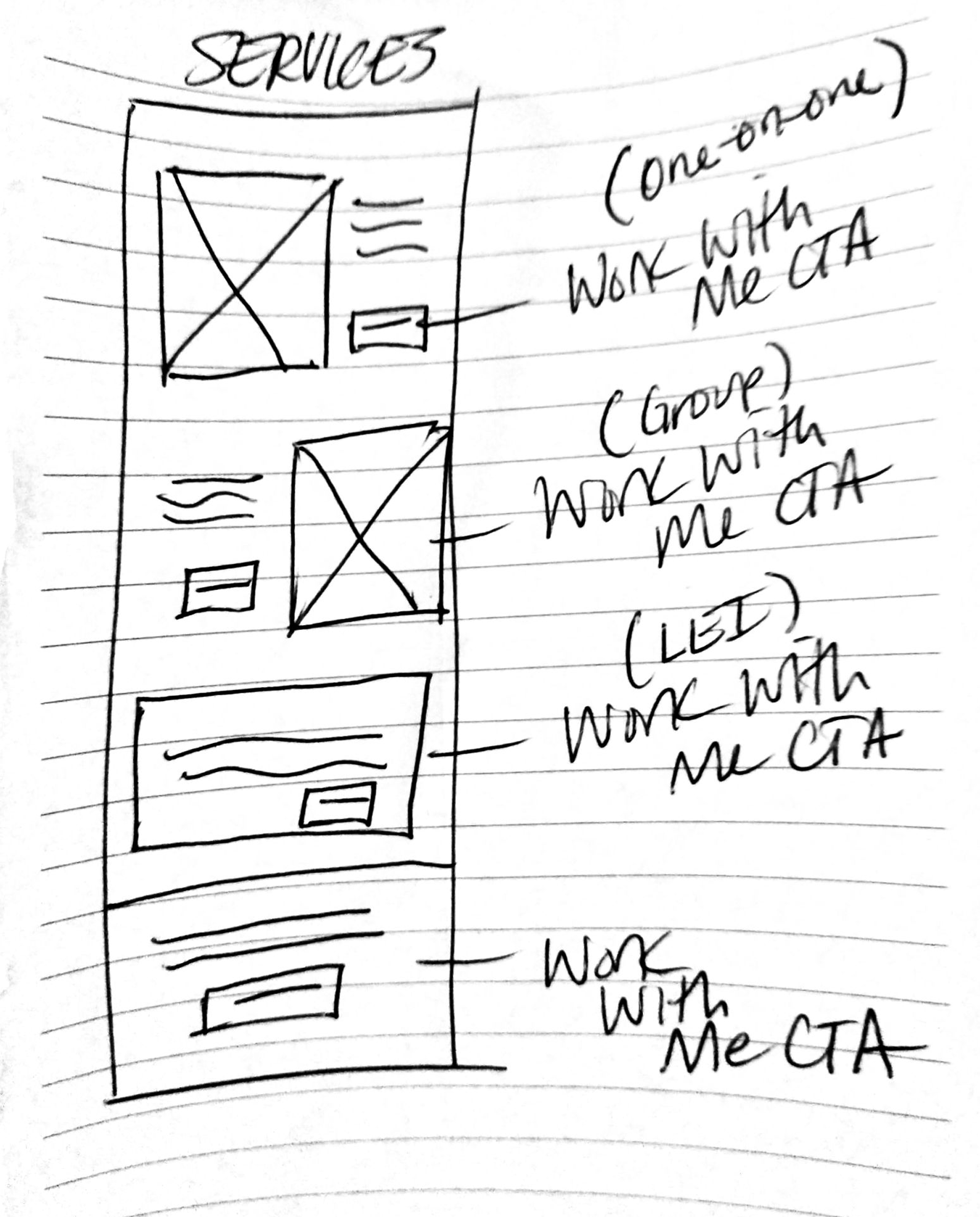
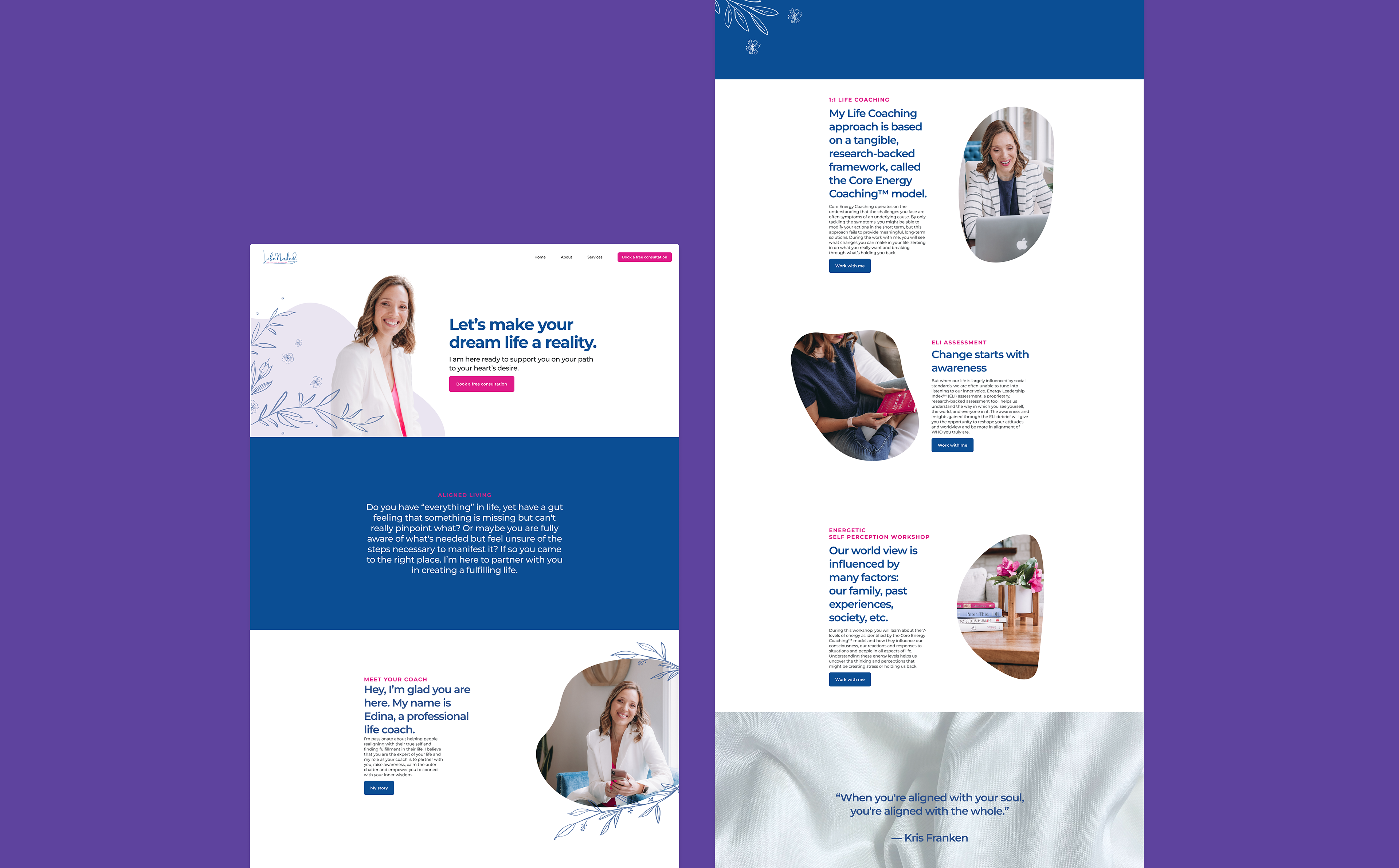
When sharing each of our designs, we saw that there was an opportunity to explain Edina’s work on the Services page. She specializes in Transitional Life Coaching, helping people through any life change. So we wanted to make sure that potential clients can identify challenges that Edina can help them with by listing them on the website.
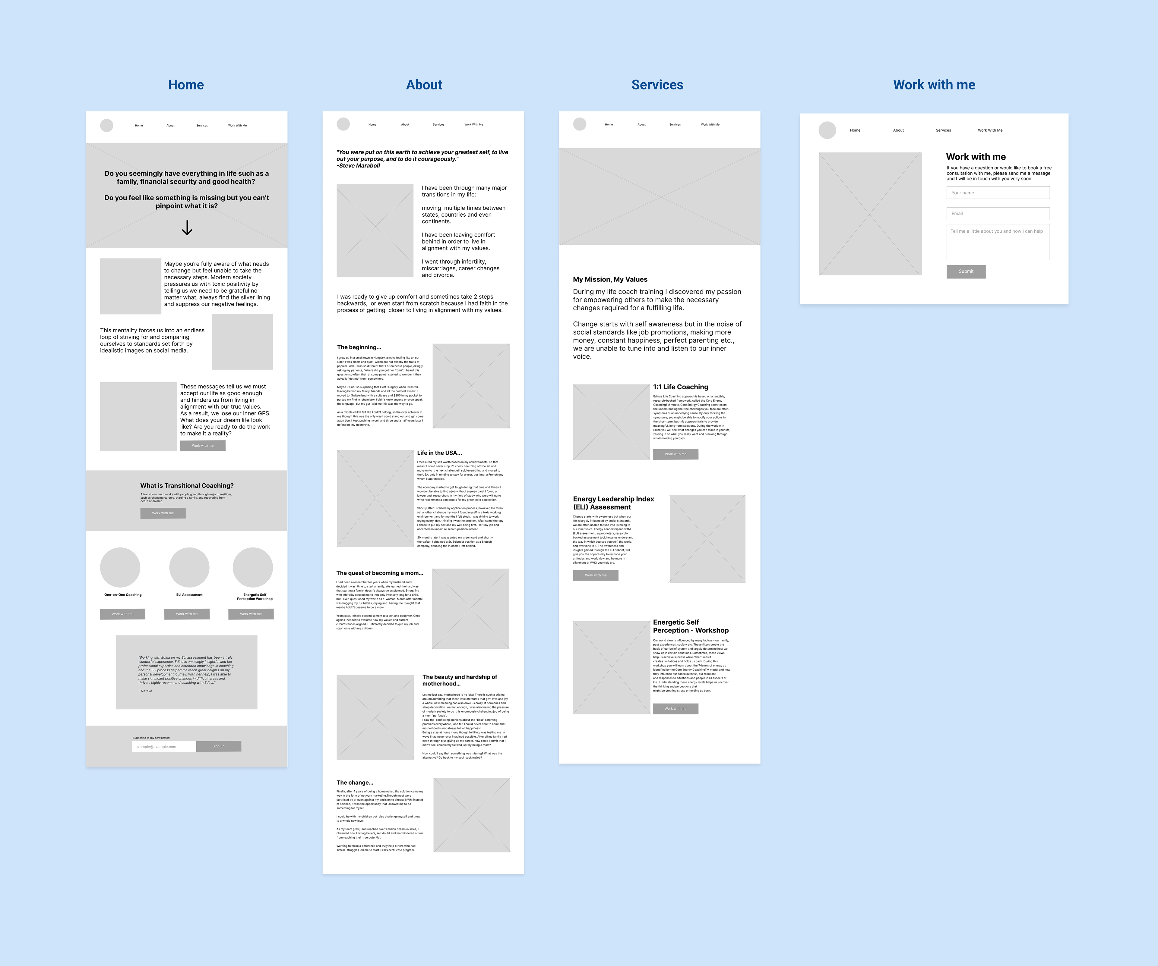
To further develop and refine the user flow and navigation of the website, I created mid-fidelity wireframes.
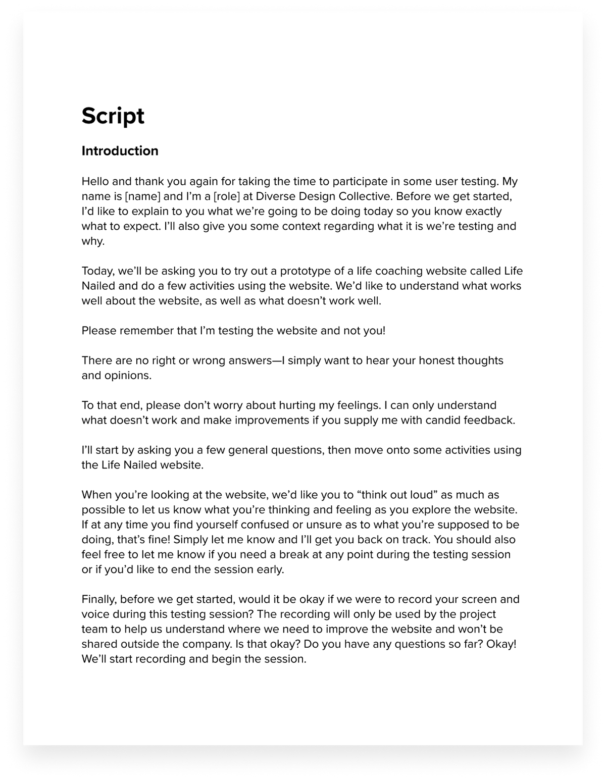
I wanted to test out the user flow to see what our users thought about the navigation and functionality of the website so I was one of the moderators who conducted a usability test.
Research Goals & Objectives
1) See if people understand how to book a free consultation through the contact form
2) Uncover any usability issues in the process of booking a consultation
3) See what people think of the About page
Analyzing test results and making changes
After capturing all usability testing findings, I discovered that the most common observations and feedback were about the About page, which was too long to read. Another discovery was the lack of information regarding booking a free consultation, which is the primary action we want users to do.

To make Edina’s biography less overwhelming to read on the About page, I decided to use a carousel to break up the content.
When we presented our findings and possible solutions to Edina, she was hesitant to follow some of our recommendations, such as condensing her copy. So that's why I suggested using a carousel so she could preserve the length of her story but simply adjust how we presented it. I then implemented these changes in the mid-fidelity wireframes.
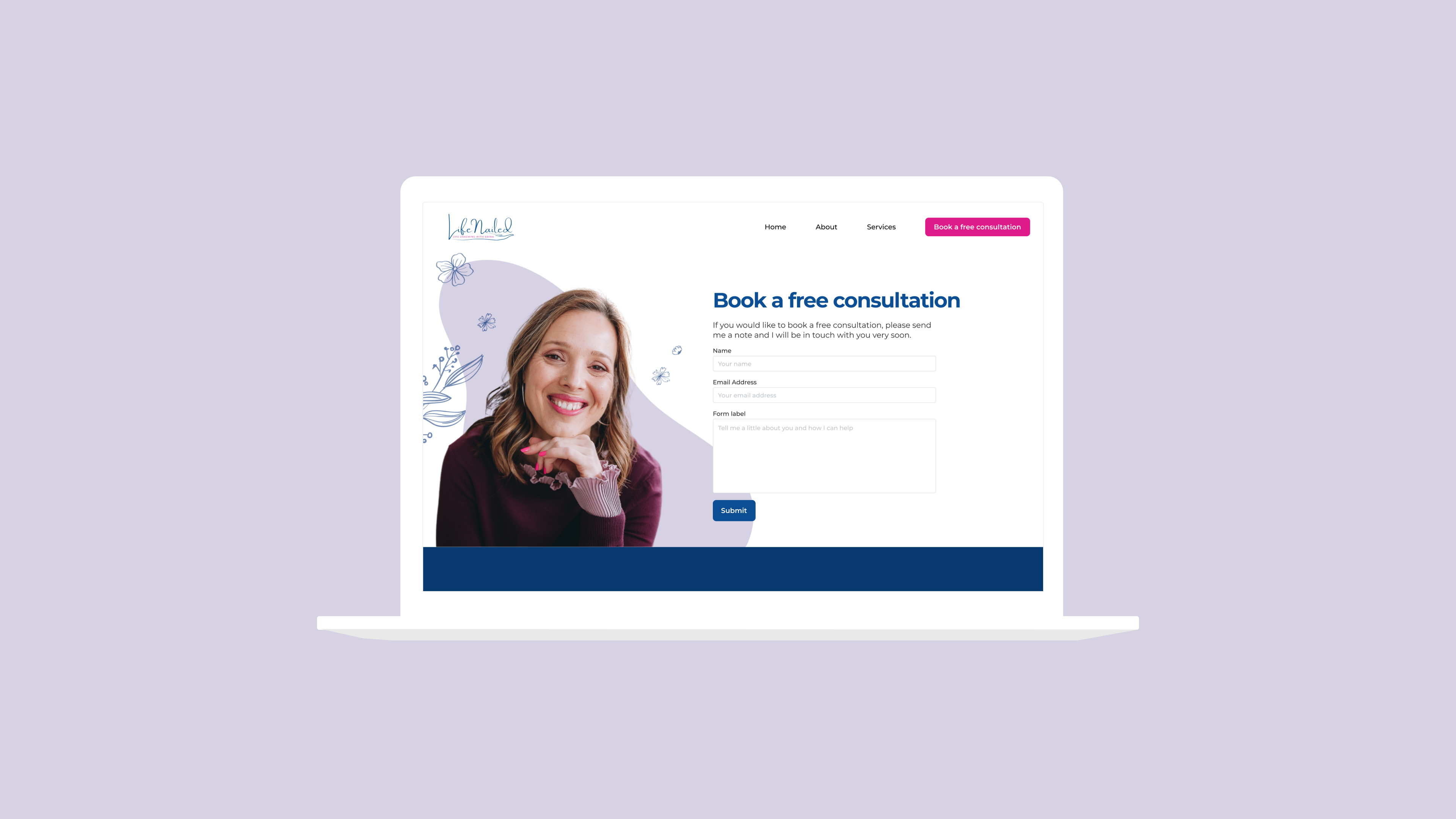
To make it clear to our users how they can book a free consultation with Edina, I decided to rename some of the call-to-action buttons to Book a free consultation...
and rename the Work with me page to Book a Free Consultation for consistent language.

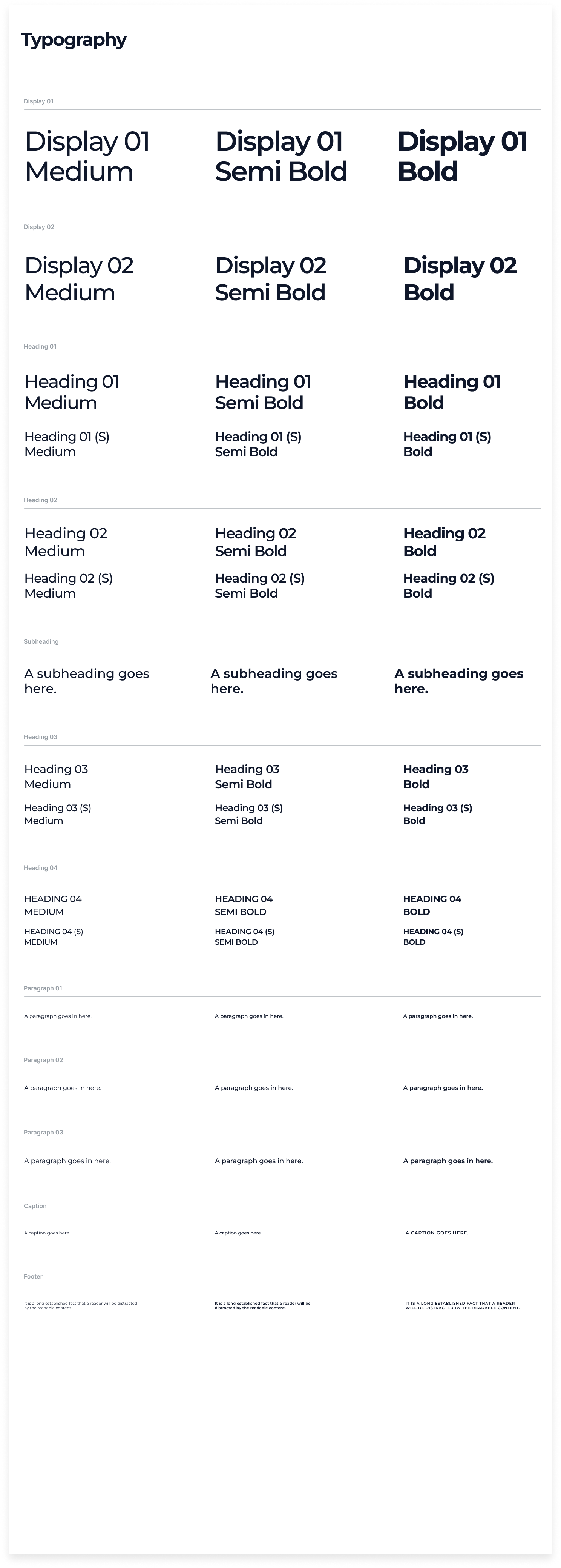
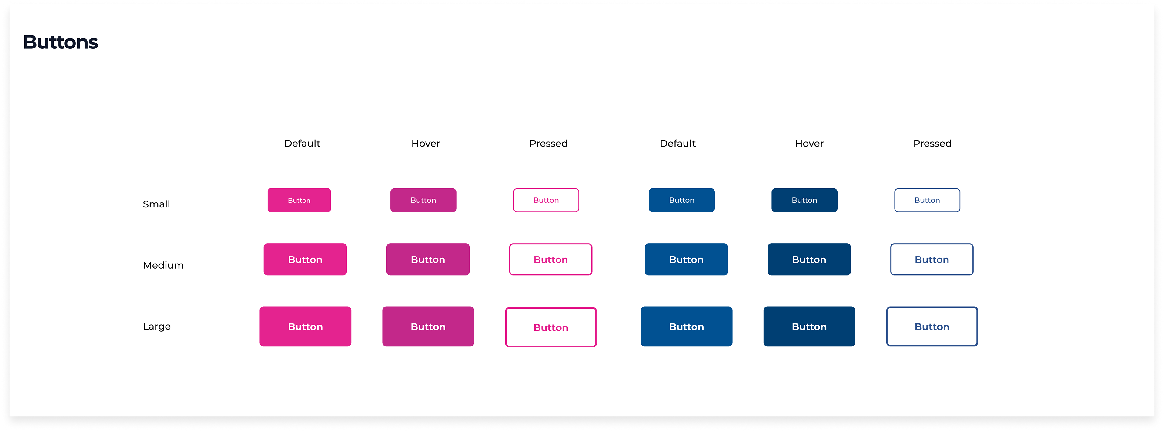
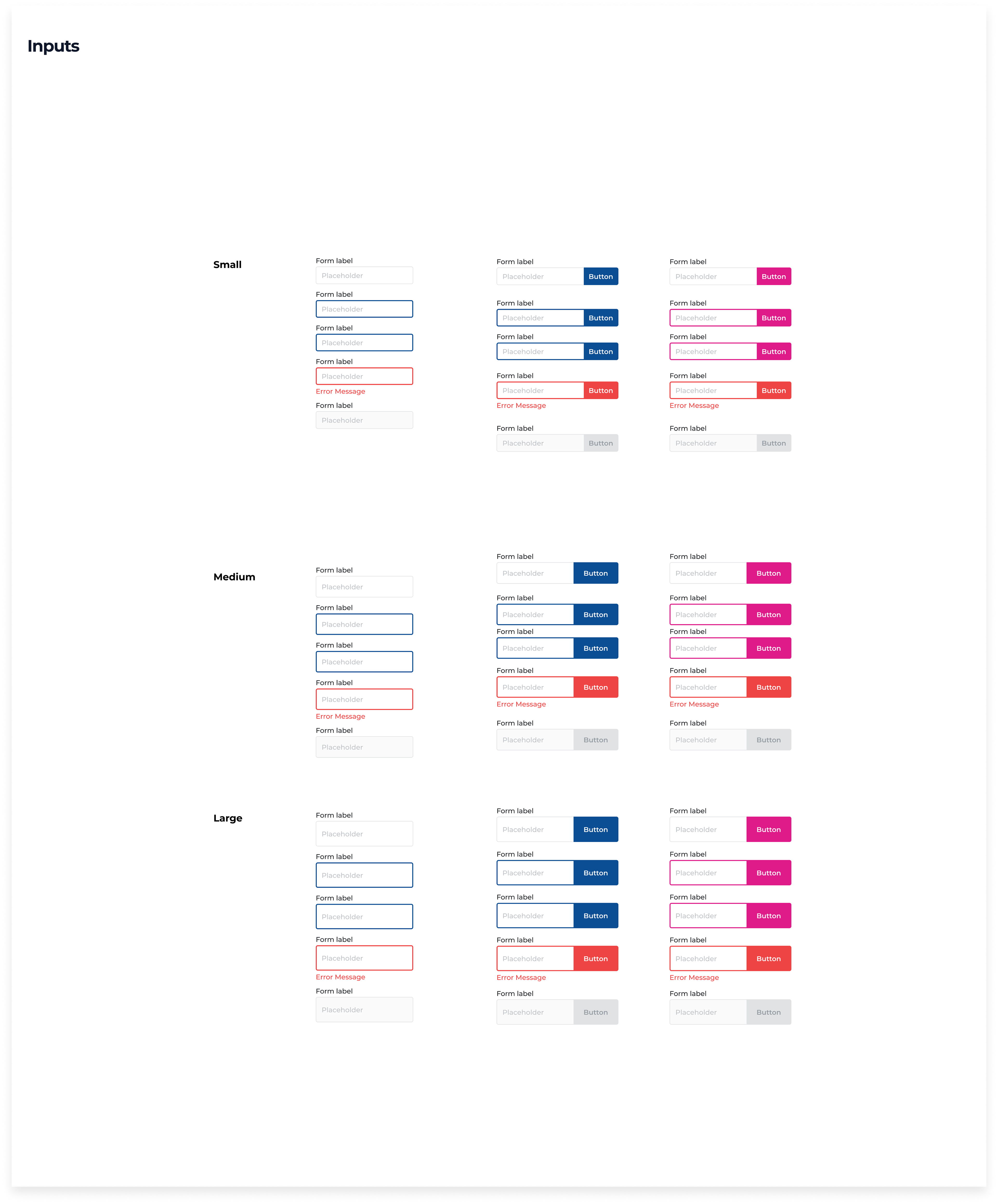
Extra attention to detail & visual design
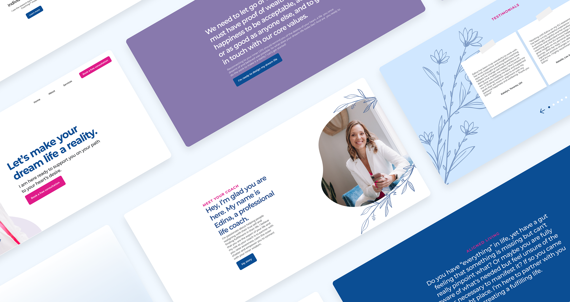
I moved forward with finalizing the design and creating a harmonious design system. The end product was a beautiful, clean, and modern website that focused solely on Edina's services, background, and experience as a life coach and how clients can book a free consultation with her.

Floral illustrations, organic shapes and cool-toned hues create a safe, relaxing and calming atmosphere for the user.
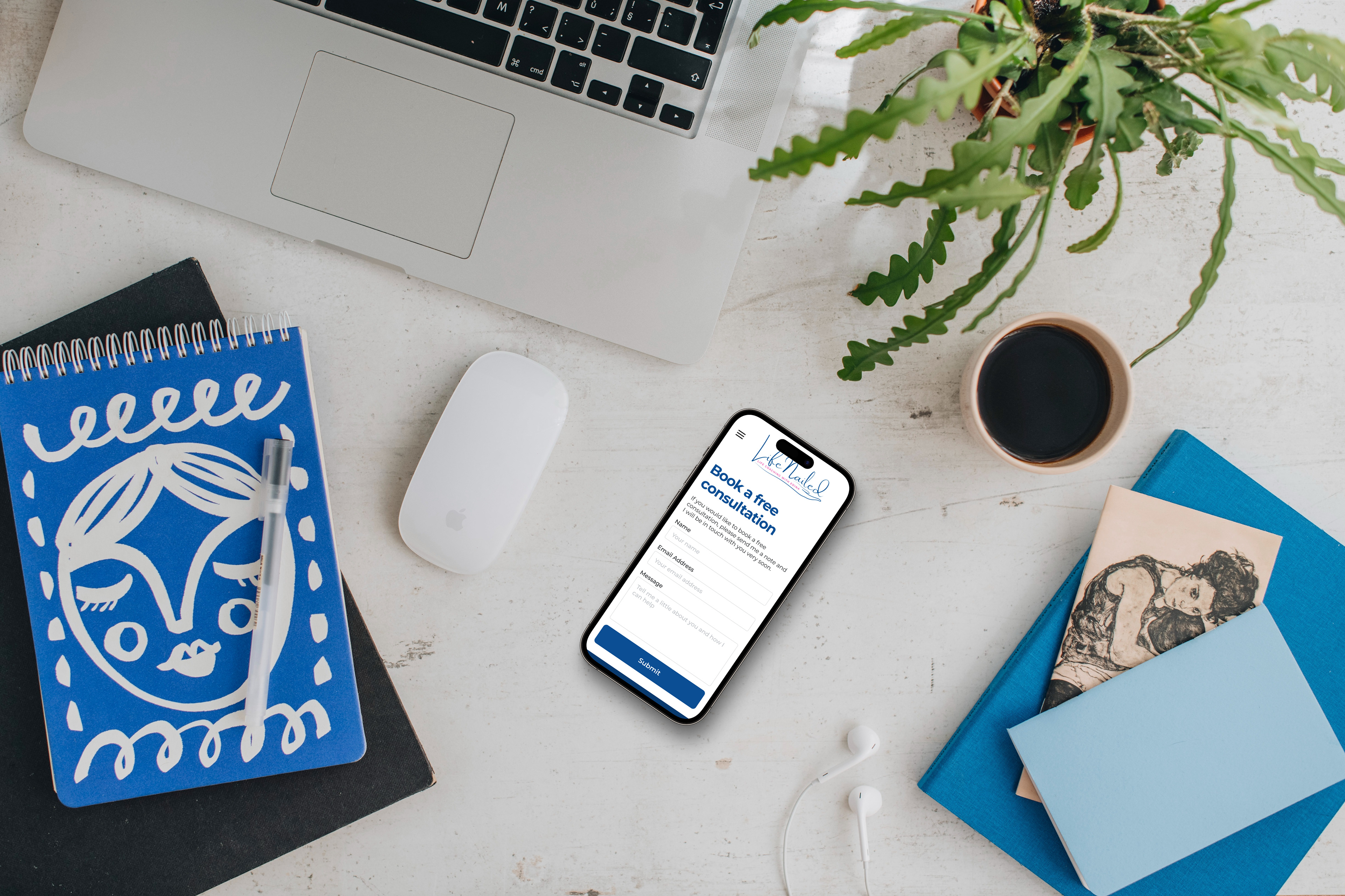
In the end, the website was developed and launched. Edina now has a responsive website that she can use to connect with new, potential clients. I plan to follow up with her in a few months to see how business is going.
I learned that clients may not fully understand the work of a UX/UI Designer and that the best way you can show your value or resolve your disagreements is through data. Throughout the project, she communicated particular things she wanted and decisions she made based on her judgment.
For example, she decided she wanted to change the color palette after we presented the final prototype. She was concerned that her initial colors were too feminine and would turn off her target demographic of men in need of life coaching. To see if that were true, we could have performed research such as A/B testing to see what her users prefer.